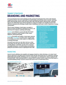
Agencies can redefine their image and boost ridership by creating clear graphics and compelling narratives that effectively communicate the advantages of public transit. Creating a good product is the most important goal for a transit agency, but maintaining a positive public image is key to success as well. Successful marketing and branding helps attract riders who do not have other transit options, as well as those who do.
In Europe the public transport is synonymous with school transportation why can’t the two be combined here for public transport to succeed need frequent buses that is every ten min and medium sized buses
Sounds like we all think that money grows on trees and there is a forest out there from which to harvest all these ‘advertising’ dollars. Has anyone thought about the budget for these ideas and how it is to be paid? Unless and until this ‘transportation’ authority can put together a product worthy of their patrons dollars, they shouldn’t come to the taxpayer for subsidization. Why not ‘act like the private sector’, not the passed public sector failures in transportation. If this campaign is to be successful, they must gain the public’s confidence and ridership FIRST!
Rebranding is essential in communicating a new system is in place, or coming. One logo with sub-branded marks communicating the functionality and cohesion of the different elements that combined create a whole. Simple color-coded maps should be fun extensions of this branded system as well.
Marketing partners: What businesses will benefit from expanding transit? These business could offer sponsorship as well as a high-traffic home for marketing materials promoting the endeavor.
Customer Service first, brands on buses after. I think the buses are festive with the ads but some of them portray an image I would much rather not see.
Listen to the comments from Stephen Jones and Kidd Redd. They are right on. Branding is a lot more than the website, logos, and graphics. Branding is the experience and most important is how customers feel about the employees the see and deal with. The best example of excellent branding I know of is Pinnacle Bank. Their logo is OK but their service is second to none. Apple, Southwest Airlines and Avenue Bank are other great examples. Forget about looking at other bus companies, look at these great examples, and start with a clean slate.
Bob Duthie nailed it, branding is critical and encompasses much more important factors than simply new logos and bus wraps.
Spending big and not yet delivering on a broad base seems fruitless. MTA understands the difficulty in building a robust rider base such as independent traffic signals, no ability of the bus driver to trigger low use cross traffic signals, and has been said by others the ability to get arrival info on their cell phones. The Millenials will likely be the largest use of public transportation. Then there is the lack of financial will of the surrounding counties to commit to this worthy experiment that could and should become the preferred commuting way. The best promotion will come from wow-satisfied riders.
MOST EVERYTHING I READ ABOVE in comments from others sounds GREAT! Ehenderson, Lynda, Julia, Stephen Jones, TJ, Sonya, George Mitchell, Kidd Redd, Jack Waddey, Ann Ercelawn, Hans-Willi Honegger
but I would add CONNECT THE BRT ASTAND SO THEY ARE LIT UP AT NIGHT for consumers and bus driver to SEE IN THE DARK! (they haven’t even been hooked up to electricity over the last 6 months from downtown all they way down Murfreesboro Road to Hickory Hollow ….. very frustrating for elderly and disabled folk and don’t really see how the bus driver see the BRT stops AT NIGHT!
Since people usually listen to the news in the morning, just remind the public via major stations 5, 4, 2 or whatever to go to a website that will explain the new transit system. This is how I would like Nashville MTA/RTA to communicate with me.
I like the idea of the door knockers, letting potential riders know the schedule, etc. My company UCC will be glad to supply these logo pieces.
1- different campaigns for different segments of the market, are you recruiting or encouraging?
2- style and place to emphasize that pedestrians and transit users are valued by the community above single occupancy auto use
3- easy to find and logically placed near where you’d look to use it and easy to read. Perhaps an active and attractive campaign on the bus benches. Or annotated signage along the bus routes
4- consistent with other metro dept graphics – brand the city
5-emphasize interface between pedestrian and bicycle use – highlight where there is seamless connectivity and a solution to the “last mile” issue
6- make use specific map overlays available online; connect the parks, visit major tourist attractions, visit college campuses, attend multiple concerts, get from your hotel to …
7- integrate protransit message in mnps curriculum
When talking about branding, we must first consider what that entails. Branding is the function and the visual system. Both must live together harmoniously to create a successful brand. Ideally the graphics system (a logo alone is not branding) and user experience should make recognition and ease of use a priority. High visibility street signage, easily navigable maps and stripped-down streamlined apps should be the goal of “Branding.” Get the information to the public in the smartest and easiest way. Provide better experiences and create an ad campaign that highlights these new benefits.
There are ample negative connotations attached to transit, traffic and bus ridership in Nashville. I would highly suggest a rebrand merging the MTA and RTA services as one entity even if they currently function as separate ones. Here are 3 reasons this would be of benefit.
1- Creating a website and app that serves regionally all modes and agencies of transit will make it clearer for the public. It seems a no brainer to put all transit information in one place digitally. A unified smart-phone app and companion website application will take away steps the user has to go through to glean information and will help them get on their way.
2-A unified payment system could also encourage the growth of transit mobility for citizens of the region vs. just the city of Nashville. With gentrification a real problem and people being forced to live further outside the city, having an integrated system will streamline their steps to a successful commute when using multiple modes of transportation. See San Francisco’s “Clipper Card” which can be loaded and reloaded with money that can be applied to both city and regional fares.
3-With a unified rebrand, we have an opportunity to ditch the negative baggage associated with the current system. But, in order for this new approach to be successful, steps have to be made to deliver better functionality and amenities to the public. A rebrand doesn’t make sense if there are no added benefits. The public will demand more.
It is hard to add more than this until some of the other transit strategies are decided upon. Creating a graphic system without a clearer systematic hierarchy will prove difficult, but luckily there are plenty of talented designers and information architects in town to consult with when these directions are chosen and implemented.
Unifying is simplifying.
Neighborhood campaigns. Door hangers/knockers to let the community know what bus routes are available in their neighborhoods. Some don’t have a clue a bus runs through their neighborhood. Also, show a cost breakdown of riding the bus vs. buying gas monthly for their cars if they drive the same distance plus parking fees.
Yeah, the buses completely draped in one big ad is really tacky and confusing.
Beyond tacky, buses covered in advertising make them very difficult to identify for visitors and tourists.
Keep the buses looking professional.
The adds you choose to accept for your buses are the largest image on or in the bus so those adds are the largest reflection of your image. Most of those adds scream lawyers and bail bonds. It is easy to assume that if this is the market you are marketing your advertising to this must be the population who rides your bus and people who are not regularly in the market for lawyers and bail bondsmen may think that riding your bus is not for them. Environmentaly aware people ride the bus and enjoy the outdoors but I see no REI, Bass Pro Shop type adds. Everyone who rides the bus eats but where is Kroger and Chipotle and some of the amazing Nashville food establishments.Where are the symphony adds and the Tennessee State Museum adds. These are the adds you see in Washington, Philadelphia and New York. You are currently branding yourself as the travel alternative for people facing legal challenges.
Good points about the lawyers and bail bonds. I don’t know if the ads need to be upscale, but they certainly shouldn’t be so down-scale. Getting rid of ads altogether, or making them smaller and in certain specified spaces on the bus dedicated to ads rather than plastered over the whole bus (as suggested by others) might be worth considering.
Very nice, but brands are behaviors, not visual identity. The latter is great, but before a brand/rebrand, transit needs to work on how it bahaves with consumers. How user-friendly can we make it? For instance, when I walk up to a bus stop, why can’t my phone tell me how far away the bus is, like UBER or Lyft? Can I pay easily with a couple of taps? Is route info clear and easy to understand?
Get the experiences right first. THEN do logos.
My two cents.
Woops, typo. BEHAVES
Hey there Kidd
here’s the news:
http://www.tennessean.com/story/news/local/2015/11/29/nashvilles-real-time-bus-app-way/76387876/
Branding needs to by catchy; must appeal to all sectors, should address convenience, on-time performance, cost and ease of payment, cleanliness, safety, wifi and other conveniences, short-route segments, particularly in the downtown area, might even include a live music performer.
Communication needs first to be the big sell–mostly TV. Then communication via e/m should be almost the exclusive methodology.
I would like to see MTA stop covering their buses with ads! Often there is no MTA logo anywhere on the buses. I missed the bus once before I realized this. Be proud of MTA. If you must use ads, they should be confined to a consistent space on the side or rear of the bus, but not completely covering the bus.
advertise in local TV, large ads in the Tennessean and local newspapers, i.e. West Meade News, send well designed flyers to single households,
set up information meetings at universities in Nashville. Students will talk to peers, faculty, staff and start awareness.
Design posters for display in restaurants, banks and shops.